I have ADHD. Every time I pick up my phone, there's a good chance I won't remember why I did it. I'll unlock the screen, get pulled into something, and 30 minutes later I'm catching up on news or just staring at the screen. The thing I picked up the phone to do never happened.
Now imagine that thing was checking when your medication kicks in. Or whether it's wearing off. Or if it's safe to take a second dose. You need that information, but getting to it means opening an app. And opening an app when you have ADHD is already the problem.
Every medication tracker I tried worked the same way. Open the app. Check the timer. Close the app. Repeat. They all lived inside themselves. None of them showed up where I already was.
I knew exactly what I wanted. Live Activities on the lock screen so I could glance at my phone without opening anything. A visual dial that maps onto a clock so my brain can process it instantly. Calendar integration so my medication cycle shows up next to my meetings, not in a separate app I have to remember to check. The whole point was to never need to open the app.
No one had built this. So I built it. It's live on the App Store.
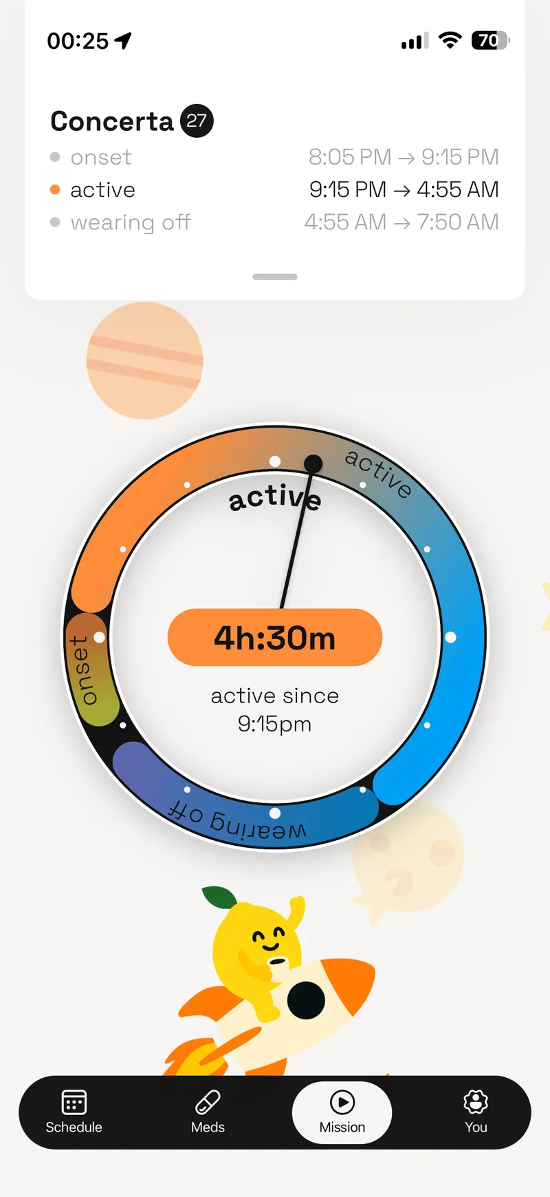
The medication dial
Why a dial
ADHD brains are visual. Not "prefer visual learning" in the way everyone claims on their resume. Actually, structurally visual. Glanceable information beats readable information every time. A number that says "2 hours 14 minutes remaining" requires processing. A dial that overlaps with a clock requires zero processing. You look at it. You know where you are. Done.
The dial concept was the idea from the very start. It was never in question. What I iterated on was how it looked, how it moved, how it communicated the medication phases as they shifted in real time. Onset, peak, decline, clear. Each phase a different color, each transition smooth enough that you're watching your medication work, not reading about it.
The pharmacology behind it is real. All 14 FDA-approved ADHD medications have different absorption curves, peak windows, and decline profiles. Adderall IR doesn't hit the same as Vyvanse. Your body doesn't process it the same as someone else's. I researched every one of these medications myself, mapped their pharmacokinetic profiles, and built the data layer that drives the dial. No shortcuts. No generic timers.
Starting in Figma
I designed everything in Figma before writing a line of code. Every screen, every state, every transition. The dial, the mission flow, the calendar view. All of it lived as a design system first.
Then I did something that probably looks unusual. Before touching React Native, I prototyped the SVG dial in a web browser. The math behind a dynamically updating circular visualization is not trivial. Angles, arcs, gradients, phase transitions, real-time updates. Getting all of that right while also making it scalable, so the component could accept different values for color, size, and gradient, was the hardest design challenge of the entire project. Doing it in a browser meant fast iteration cycles. I could tweak the rendering, refresh, see the result, and adjust without waiting for a mobile build.
Once the math worked and the rendering felt right, I ported it to React Native as a custom SVG component. The browser prototype saved me weeks of debugging on-device.
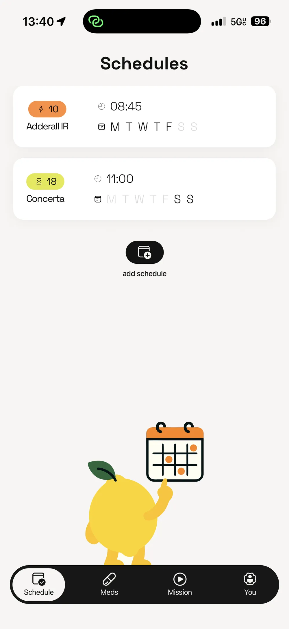
Schedules view
Constant iteration
This wasn't a project where I designed it, built it, and shipped it. I was using the app from day one. Every single day, I was testing what worked, what didn't, what felt natural, what felt forced. When something bugged me, I changed it. When something worked for a week and then started to annoy me, I changed that too.
I gave access to preview versions to friends and iterated based on their feedback. But the most important tester was me. I am the user. I take ADHD medication. I live with the exact problem this app solves. That's not something you can simulate with user research sessions.
The app kept getting better because I kept using it. Not three redesigns. Not a big reveal. Constant, daily refinement until every piece started to make sense and fit seamlessly into my daily life.
Fighting Apple
Anything that had to do with Apple was the hardest part of this project. Not the product design. Not the pharmacology research. Apple.
Live Activities nearly broke me. Apple's documentation on how to interact with Live Activities without relying on server updates is terrible. I'm not being dramatic. It's genuinely incomplete. To get the medication phase showing on the lock screen, I had to learn Swift and SwiftUI from scratch, write a custom widget using Apple's ActivityKit framework, and then build Objective-C bridges to connect it all back to the React Native layer. React Native can't touch the iOS lock screen directly. The bridge between these two worlds, React Native on one side and native iOS on the other, was bridging hell. There's no other way to describe it.
Calendar integration was another Apple fight. Getting medication cycles to appear as native calendar events, properly synced, properly formatted, without conflicting with the user's existing calendar data, required navigating Apple's EventKit APIs and their particular opinions about how third-party apps should interact with user calendars.
App Store review took a month. Apple moves slow. There's nothing you can do about it except wait, respond to their questions carefully, and wait some more. After four months of building, a month of sitting in review limbo tested my patience more than any technical problem.
How I built it
I designed every screen in Figma, then built the whole thing myself with Claude Code as the development engine. The stack is React Native + Expo + TypeScript with Zustand for state management.
Most people using AI to code either vibe it, letting the AI decide the architecture in real time, or use a built-in plan feature that generates a plan you can approve but not edit. I write specs. Before any code gets written, there's a detailed document in the project covering the approach, trade-offs, and edge cases. I annotate it, revise it, reject what doesn't work, and only then does Claude execute. The spec is a real file I own, not a chat message that disappears.
That matters more than it sounds. Weeks after implementing a feature, I could open the spec, see exactly what was built and why, track what was done versus what was deferred, and iterate from a clear starting point instead of reverse-engineering my own code. When I needed to add tests, the spec already described the expected behavior. When something needed to change, I revised the spec first and let Claude implement the update against a known plan. The whole project stayed navigable because every decision was documented before it was executed.
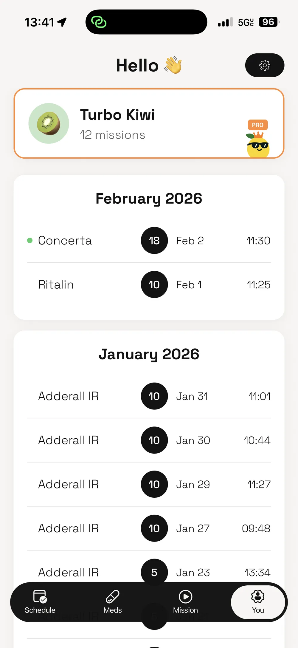
Mission history
Privacy and pricing
Your medication data never leaves your device. That was a deliberate choice from the start, not a marketing bullet point I added later. Medication data is personal. It's nobody's business except yours.
Pricing follows the same principle. The full app experience is available right away. No trial gating. No "upgrade to unlock basic features." If you take medication sporadically, you still have access to 7 free missions per month. Pro is $4.99/mo. No ads. No data selling.
The logic to make this work cleanly took some discovery. Free mission counts are saved to iOS Keychain so the counter survives app reinstalls. Without that, someone could just reinstall the app to reset their free missions. Small detail. Important to get right.
Get Zesty started because I was tired of not being able to use Live Activities for something that actually mattered to me. Four months later, it was on the App Store. That wasn't the plan. I just needed an app that worked the way my brain does.
Status
Live on the App Store
Tech
Skills